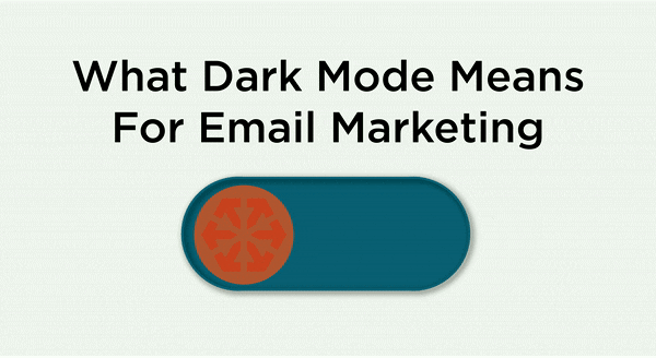
What Dark Mode Means For Email Marketing
Nothing shakes up the marketing world like a technology trend.
The latest? Dark mode. A simple feature that allows a user to change the background color of an app or window to black.
What’s the hype? Well for one, many are saying putting your phone into “dark mode” can allude to a handful of health benefits. The majority of us spend our entire day looking at bright, blue-lit screens. Not only does this lead to some seriously dry and painful eyes by the end of the day, but long term it can lead to eye strain, neck, and shoulder pain, headaches, blurred vision, lack of sleep, or even obesity. With the severity of these blue light side effects, it’s no wonder why everyone’s switching dark mode on. Another pro? Longer battery life. Dark mode display can prolong the battery life of your smartphone significantly. Finally, it looks pretty darn cool if we do say so ourselves.
As with most trends, we marketers must align. Dark mode isn’t going anywhere soon, so there’s no better time than the present.
Dark Mode: A New Challenge for Email Marketers and Developers
While dark mode is ideal for digital device users looking to minimize their blue light intake, it’s not necessarily ideal for email marketers and email developers.
In the inbox, dark mode changes dark fonts and background colors to light, and light fonts and background colors to dark. As for how the different email systems do this, well that’s yet to be determined. And with the inability to define exactly how an email will be displayed, email marketers and developers have lost control of their subscribers' inboxes.
This presents an ethical dilemma for those of us in the industry. Do we accept that this is how our subscribers wish to view emails and let it be? Or do we attempt to hack it for our needs? (Perhaps this is a topic for another blog, so we will leave this here for now!)
You don’t have to take a stance just yet, but you should look for ways to at least optimize your emails for dark mode. If you don’t, you run the risk of messages rendering incorrectly or giving your audience a poor viewing experience.
5 Tips to Optimize Your
Emails for Dark Mode
1. Use transparent images
Most email service providers who offer dark mode today will automatically alter the colors in CSS, but not colors within images. If dark mode changes the background color of your email and you’ve used a transparent image, it will appear intentional. Though, there are some situations where this isn’t necessarily true like with black icons.
![]()

2. White stroke your black text or icons
On a black background, anything black will disappear. If it’s possible, add a white stroke to dark text or icons so that when the background colors change, readability improves, and the design looks intentional.
3. Create effects of elevation with lighter surfaces.
In light mode, shadows are used to create depth. The closer the object is to the light source the larger the shadow. While dark shadows don't accomplish this in dark mode, we can use the same idea and apply it to the surface color.
Atmos.style recommends that instead of changing only the shadow size, make the surface lighter. The closer the object is to the light source, the lighter the color.
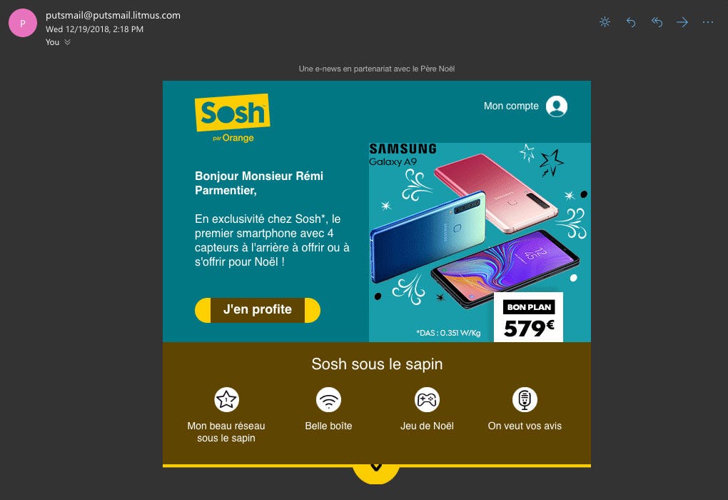
4. Mix images and background colors with care
Or to be safe, avoid it altogether. We know that dark mode changes background colors but not images, so mixing the two can lead to design inconsistencies. See the example from Sosh below, more specifically, the CTA button and image.

UI experts recommend avoiding saturated colors as they create optical vibrations in a dark mode which causes eye strain. Saturated colors also make it harder for websites to pass accessibility standards, a factor considered in Google rankings.
When choosing colors for dark mode, desaturate them with enough contrast against the dark surface. In general, it is recommended that your colors should have around 20 points lower saturation in dark mode than in light mode.
5. Test... Test... Test...
There is still so much that is unknown with regard to dark mode and email. Before sending, it is critical to test, test, test. Test your messages in both light and dark modes to be sure they look right in each. Testing also allows you the opportunity to identify your own design tricks that work for light and dark modes. Most email marketing platforms will begin to offer (if they don’t already) a dark mode preview. This will make it possible to see emails in dark and light mode the same way we preview messages on different devices and from different providers.
HubSpot allows testing in dark mode. From the email editor, navigate to the test in the different email clients tab. Here you can test how your email will look in a variety of different inboxes. Check the dark mode box to see how your emails will look in dark mode.
Below we've included shots of two emails we did for Tuskegee University College of Agricultural Environmental & Nutrition Science. While our message is still clear, the look and feel of the email changes drastically.


Email service providers are sure to continue making improvements to dark mode – improvements that are sure to make our jobs a lot easier. Nonetheless, it’s something to be aware of when sending marketing emails today.